
The Material Design team at Google unveiled Material 3 Expressive a few months ago, which they claimed to be “Better, Easier, Emotional UX”. It came along with a pretty cool looking trailer showing off redesigns for commonplace apps with crazy new UI elements.
This new design system supposedly had a lot of research poured into it, with a goal to help users identify key actions and content significantly quicker.
It’s been many months, and the “bold” new design has rolled out to Android and most of the Google apps.
Not very different
The main places updated with the new design language are:
- System & other Google apps
- Android system UI
There are astonishingly few changes.
- Blur is used occasionally
- New slider design
- A few components are animated more
- In apps, most items in lists are now containerized
In fact, the only part of the system and its apps that have really undergone much change is the notification shade.

Ehhhh
Questionable designs
After some time using the system with this new design, I began to notice a few things that seem out of place or straight up look bad.
For example, the blur. The tinted panel with a tiny blur radius just…looks bad. The choice of using mixed border radii (which you can see on the quick setting toggles) looks genuinely awful.
Then, I started noticing major inconsistencies between apps. The phone & contacts colors are strangely swapped, some layout margins are completely wrong, padding is essentially randomized, and some animations are now missing.
The “new designs” are not even that different! They just changed random components to mismatch each other.
Phone & contacts


You don’t even need to pixel peep to see the amount of inconsistency! That’s a lot of differences for two apps that are supposed to be linked very closely.
- Colors of list items are different.
- Colors of the navbars are different.
- Colors of the search bar are different. For both, they are different than the list items too.
- Sizes of the navbars are different. The sizes of the selected pills are different too!
- Sizes of the search bars are different.
- The animation between pages of the phone app now is a lateral transition, discouraged by Google’s own guidelines.
Nothing about these designs screams “emotional”.
Calculator
The calculator got absolutely butchered in its update. During its glory days, it looked like this:

Calculator before the 'expressive' update
This was honestly great use of the Material 3 design system beforehand. It used the available color palette, the buttons were padded and separated nicely, the number entry field was distinguished well, and there were great subtle animations.
Here is it now, with the ultra mega super expressive expressed feeling emotional new UX:
Actually, wait. Before I installed the update, I spotted this in the release notes:

Oops.
Google’s assassination of the app turned the calculator into this:

What?
In summary: the “expressive” update to the calculator has brought:
- Strange padding.
- Very very slightly imperfect circles.
- Removal of
sqrt, Pi, exponents, factorial, etc without expanding. - Less distinction between the number input.
That isn’t even the worst part! Look at how the buttons shift when you press “invert”:
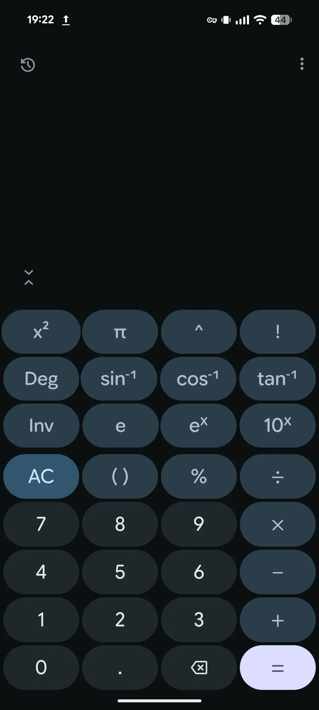
Look closely at the advanced functions.
Somehow, the buttons were made in such a way that they are not automatically aligned or sized correctly. They shift when you press “invert”, and not even in a consistent way.
sqrtbecomes a slightly wider 𝑥2- Pi through the degrees/radians toggle are fine
- Sine and cosine shift to the left slightly. Tangent becomes slightly wider
- e𝑥 shifts to the left. Both its non-inverted and inverted versions are offset incorrectly.
How does this even happen?
Clock
The clock. What happened? The font customizations is enough to kill anyone who cares about typography. Maybe Google Sans Flex should have a license clause banning these variables.
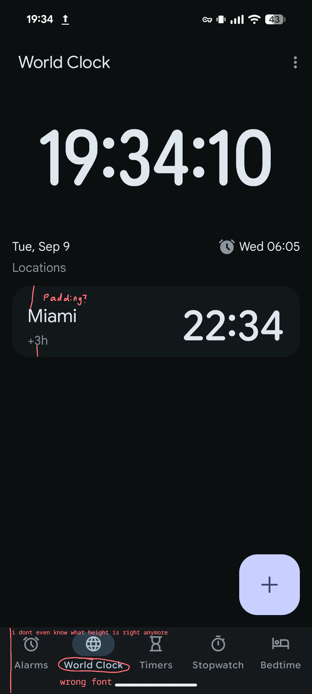
The padding of the locations is not the same for the top and bottom, and the font of the navbar isn’t correct—or is it? The design specifications are pretty much irrelevant now.
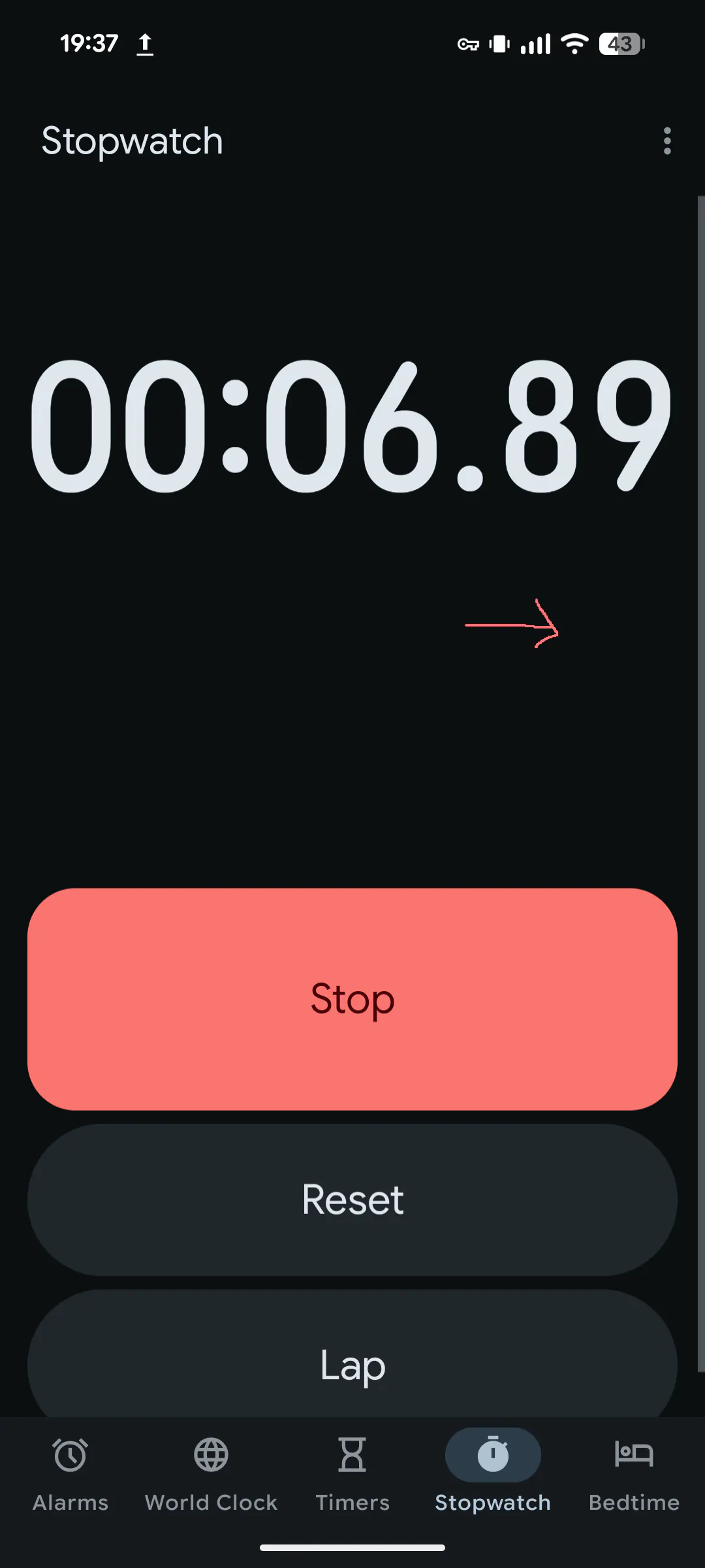
For some reason, the stopwatch is scrollable even though it shouldn’t need to be. They allocated way too much space for the duration. To add even more confusion, all the animations were removed. Why?
Every one of these apps has to have some weird layout bug. The clock is no exception here.
In the “World Clock” view, the layout shifts every second.
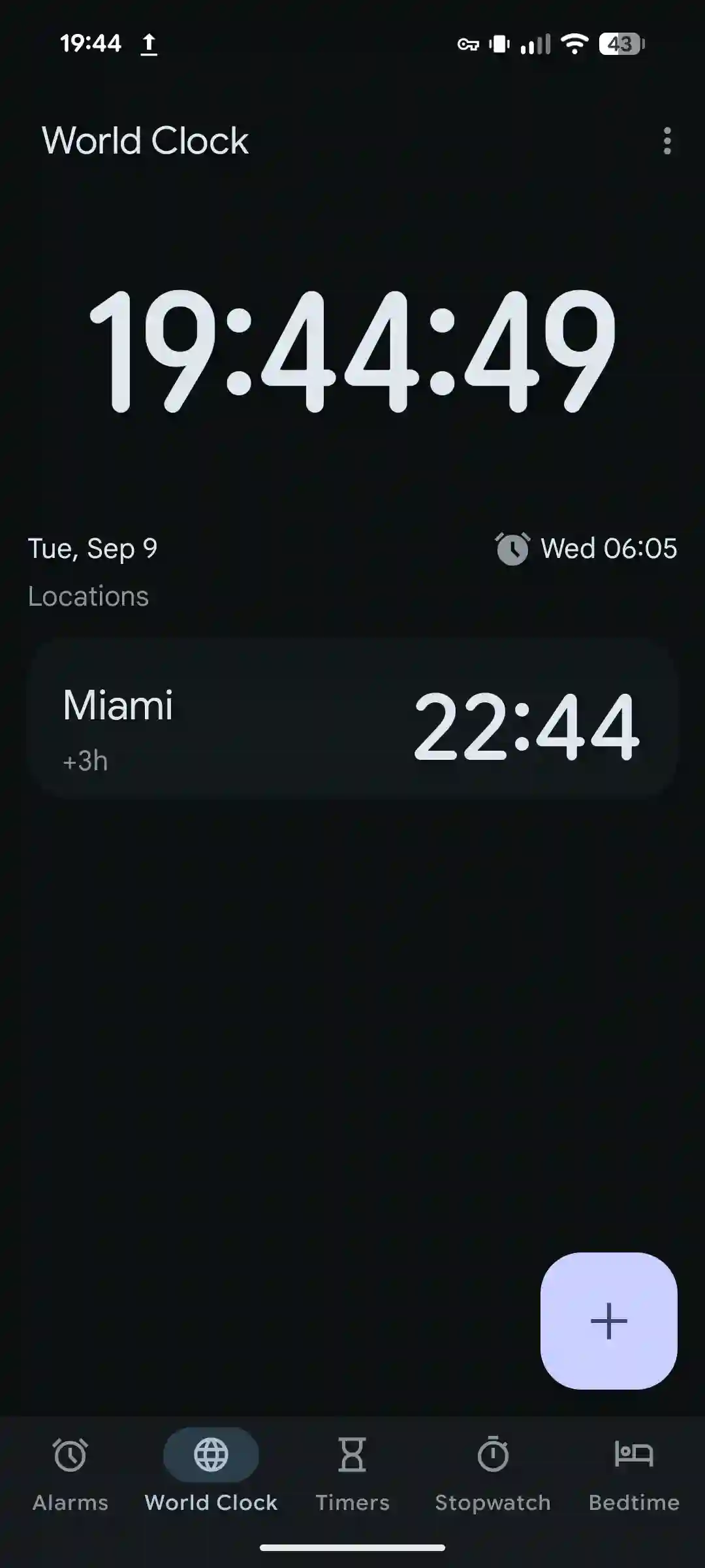
It seems that even though the stopwatch was assigned a fixed height (too much), it was not done for the world clock. As the font dynamically resizes (for some reason), every other element in the page moves. This is painfully easy to spot.
Things I think look awful
The quick settings
The only redeeming part of this interface are the animations and bounciness of the notifications. It’s probably the best part of this entire redesign.
- What is going on with the quick settings buttons? The icons are massive. It doesn’t look good when the active items are squared.
- The designers still insist on a separate color for the notifications panel and the quick settings. Please just give up on it. This tinted, not frosted, weirdly small blur radius looks amateur. At the very least bump up the blur radius, please.
- What are these new icons? I know Google wants iOS users to switch, but I doubt the orientation of the battery icon will be a deal-breaker for anybody.
The app drawer

I have similar problems with this as the quick settings.
- The blur radius is too small. This looks quite amateur, like a new CSS designer just discovered
backdrop-filter: blur(16px);. - Why is this panel a sheet? The quick settings aren’t a sheet. Before, this panel would fade in and only move slightly as you swiped up. Now, it goes all the way from the bottom of the screen, which is a quite unconventional move for most of the UI.
- The animation after swiping horizontally between personal/work isn’t bouncy. This is inconsistent with the file picker.
Dropdown menus
These are in my top 5 for worst material components. Why do these look so janky? They got worse in material 3 expressive when they decided to shift around padding and mess with icons.
The many popovers of Android


This is insanity.
Conclusion

Expectation

Versus reality
Material 3 Expressive was supposed to be unique in that apps would look all different and unique while still following a “design system”, compared to Material 3 which encouraged identical looking apps.
I think for the native apps, they made them unique in the wrong ways.
I feel like this minor design system update was way overhyped, people going as far to say it will “kill” Apple’s liquid glass (they aren’t really competing…most consumers don’t care what “design system” their phone uses).
I’ll admit that I’m a bit biased because I like Apple’s liquid glass design more, but I feel like I’m justified in that opinion—they at least implemented their design system fully.